Nel momento in cui un artista prende consapevolezza di quale desidera sia il linguaggio più affine alla propria inclinazione, sia essa caratteriale che creativa, lo stile pittorico si trasforma in vero e proprio messaggio, invito visivo all’osservatore a scavare a fondo nella propria interiorità ma anche a scoprire il significato spesso implicito che si nasconde dietro la quotidianità. Ma soprattutto l’esortazione è a non soffermarsi al dettaglio, piuttosto cercare di comprendere l’aspetto più generale di tutto ciò che accade o che capita per caso sotto lo sguardo sensibile dell’autore dell’opera. Questa è esattamente la dimensione creativa in cui si muove la protagonista di oggi che sceglie la non forma proprio per infondere alle sue tele un messaggio più emozionale e al tempo stesso attento all’armonia estetica.
Nella fase di ribellione nei confronti dell’arte tradizionale, emersero molti movimenti che fecero del distacco dalla realtà osservata la base essenziale della propria produzione, perché secondo gli artisti aderenti l’arte doveva prescindere dalla forma conosciuta e anche dall’emozione, per essere apprezzata e valorizzata nella sua pienezza. Fatta eccezione per l’Astrattismo Lirico, il cui padre fondatore Vassily Kandinsky aveva ipotizzato un tenue legame con il sentire interiore, tutti i movimenti successivi, dal Suprematismo Russo al De Stijl, dall’Astrattismo Geometrico all’Op Art, mostrarono al contrario un approccio oggettivo, quasi scientifico e volto a sottolineare il distacco completo da tutta la realtà osservata, peraltro in quei periodi tutt’altro che piacevole considerando i venti di guerra che contraddistinguevano l’intera Europa. L’immagine non doveva distogliere dall’ammirazione nei confronti della composizione creativa, il gesto plastico non poteva ridurre la sua importanza a una mera riproduzione di ciò che lo sguardo poteva già vedere, e soprattutto la soggettività non poteva prevalere sull’atto creativo che doveva essere accuratamente preparato e studiato. Eppure tutte queste correnti non ebbero una vita molto lunga, il Suprematismo di Kazimir Malevic fu presto superato in importanza dal rigore geometrico e dai colori primari di Piet Mondrian, così come l’Astrattismo Geometrico di Manlio Rho e Mario Radice, nato come evoluzione e ammorbidimento della rigidità del De Stijl, fu poi poco dopo superato dall’Op Art di Victor Vasarely; il motivo di questo alternarsi rapido dei movimenti dell’Astrattismo era sicuramente la tendenza allo studio e all’evoluzione degli artisti aderenti alle varie sotto correnti, ma soprattutto la mancanza di emozione, di quel toccare le corde dell’osservatore che impedì a molti amanti dell’arte e collezionisti di percepire con l’opera quella connessione sottile attraverso l’anima, di fatto fondamentale. Furono gli anni Cinquanta del Novecento a portare una radicale innovazione nell’Arte Astratta, con l’irruenza creativa di Jackson Pollock e dei suoi colleghi fondatori dell’Espressionismo Astratto per i quali il gesto plastico non poteva prescindere dall’interiorità, dal sentire, da tutte quelle tempeste profonde che si manifestavano poi sulla tela sotto forma di irruenza, o di calma riflessione o ancora attraverso un’esecuzione segnica, di cui i colori erano interpreti. Proprio in virtù dell’intensità espressiva, questo movimento nel corso degli anni è stato reinterpretato da grandi maestri contemporanei che hanno saputo apportare il proprio tocco personale, come Gerard Richter, uno dei più quotati artisti viventi, il cui Espressionismo Astratto si è evoluto fino a sfiorare la fotografia e la tecnica mista. L’artista austriaca Isolde Mischkot a sua volta ha compiuto un percorso di ricerca artistica che l’ha condotta inizialmente, quando ancora bambina, a misurarsi con soggetti figurativi e i colori ad acquarello, poi nel corso del tempo, malgrado l’insicurezza nelle sue doti artistiche che le ha impedito di intraprendere gli studi specifici ma ancora totalmente affascinata dall’arte al punto di visitare costantemente mostre e musei in ogni parte del mondo visitata durante i suoi viaggi, ha maturato uno stile affine alla sua indole creativa in virtù del quale ha deciso di riprendere l’antica passione e di trasformarla in percorso professionale.
Il suo Espressionismo Astratto mostra una maturità cromatica appresa durante i numerosi corsi di pittura, ma soprattutto una saggezza interiore che le consente di mettere su tela in maniera bilanciata e stabile le consapevolezze del vivere, quell’equilibrio tra gli accadimenti e la forza per prenderne atto e volgerli a proprio favore, che emerge dalle tonalità a volte piene e in contrasto armonico, altre più tenui e sfumate in scala di colore.
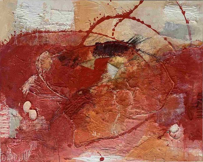
Il suo linguaggio pittorico però non riesce a fermarsi al semplice uso dell’acrilico bensì ha bisogno di introdurre anche la sperimentazione della materia, quell’intreccio di collage con l’introduzione di cartone, stringhe, tessuto, pietra, sabbia, foglia d’oro, vernice, tessuti; tutto contribuisce a sottolineare il messaggio emozionale di Isolde Mischkot, quell’invito all’osservatore a entrare in contatto con le proprie sensazioni attraverso le quali lasciarsi guidare nella comprensione istintiva delle sue opere di forte impatto.
Il rosso e il giallo, prevalentemente presenti nelle sue tele, emanano una forte e decisa energia, la medesima che è necessaria ad affrontare con coraggio e determinazione le circostanze che si susseguono e che, anche quando improvvise e travolgenti, sono necessarie all’evoluzione dell’individuo, per misurarsi con la propria capacità di rialzarsi e di trovare un senso a tutto; le opere in tonalità più tenui, talvolta arricchite da foglia oro, sembrano espressione di un equilibrio, di una stabilità da cui emerge tutta la serenità, tutto l’appagamento che dopo un percorso pieno di prove e ostacoli si riesce a conquistare. Forse lo stesso cammino che ha condotto Isolde Mischkot a rinunciare e poi di nuovo a decidere di perseguire il proprio sogno artistico.
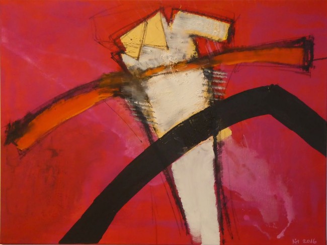
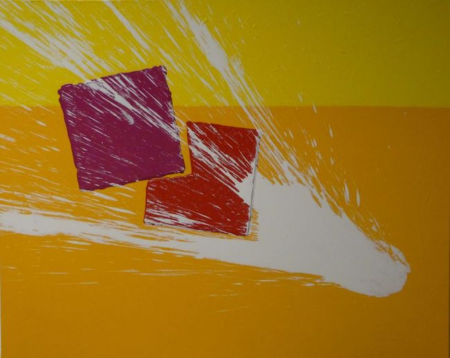
Nella tela Power infatti emerge tutta la volontà e la resilienza necessarie a oltrepassare le difficoltà, a superare gli apparenti blocchi, rappresentati da una spessa linea nera che sembra un’opposizione insormontabile nel raggiungimento del livello superiore; eppure, nonostante tutto l’essere umano, l’anima, riescono in qualche modo ad aggirare gli impedimenti, a procedere anche a costo di provocarsi ferite, raccontate dalle linee orizzontali che sembrano tagli ai lati della parte centrale della composizione contraddistinta dal colore beige, e poi emergere verso l’alto quasi dimenticando le difficoltà perché appagati dall’obiettivo raggiunto. È sempre positivo lo sguardo alla vita di Isolde Mischkot, la sua forte energia e risolutezza si propagano dalle tele e raggiungono in maniera intensa l’osservatore conducendolo nel suo mondo fatto di consapevolezza e anche di coraggio nell’affrontare gli alti e bassi dell’esistenza.
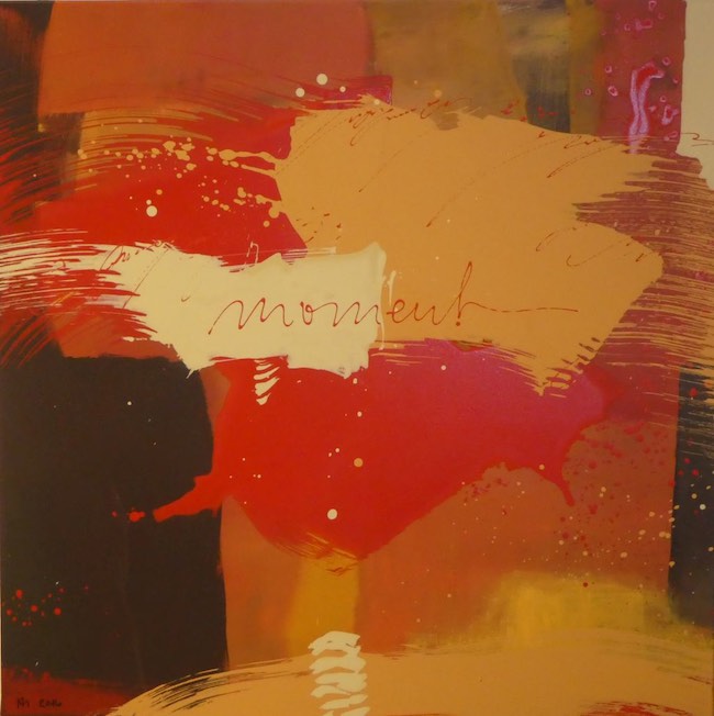
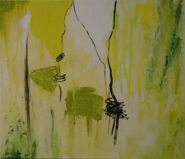
Nell’opera Moment le differenti macchie cromatiche sembrano essere le contrastanti emozioni che si susseguono in alcuni frangenti, quelle circostanze confuse che capitano all’improvviso generando un ventaglio di reazioni, a volte persino divergenti ma poi tutte convergenti nell’insieme del vissuto, di ciò con cui ciascun individuo, in determinati istanti di vita, si trova ad avere a che fare. L’attimo successivo tutto assume un significato diverso, più complessivo e dunque sta alla persona protagonista dell’evento riuscire ad allontanarsi dalla contingenza per osservare il disegno più ampio che le energie stanno indicando.
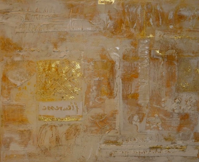
Ma il cammino di ciascuno, qualora si abbia la capacità di trarre insegnamento ed esperienza da tutto ciò che accade susseguendosi talvolta in maniera persino troppo rapida, evolve poi verso una saggezza in grado di infondere armonia, calma e serenità, che di fatto sono le sensazioni verso cui qualsiasi essere imano tende e che Isolde Mischkot interpreta scegliendo tonalità chiare, spesso arricchite con la foglia oro, come nell’opera Golden inspiration, o realizzate su supporti diversi dalla tela, come il legno, proprio per sottolineare quanto concreta e stabile possa essere l’evoluzione dell’individuo se mantiene un’indispensabile apertura verso l’ascolto di sé e delle energie che lo circondano.
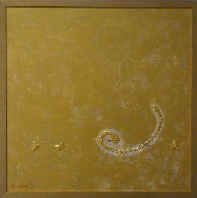
Harmony è dunque la massima espressione di questo concetto, narra di quella calma avvolgente che emerge quando si riesce a raggiungere la piena consapevolezza di sé, delle battaglie passate, della forza che è stato necessario impiegare per riemergere e per trovare quel bilanciamento funzionale a sorridere maggiormente alle circostanze senza più il timore di esserne destabilizzati. Isolde Mischkot espone regolarmente a Vienna e su tutto il territorio austriaco ricevendo consensi dal pubblico e dagli addetti ai lavori.
ISOLDE MISCHKOT-CONTATTI
Email: mischkot@gmx.at
Sito web: www.mischkot.com
Instagram: https://www.instagram.com/isoldemischkot/
Aesthetic balance and energy of colour in the bewitching artworks by Isolde Mischkot, between Abstract Expressionism and Material Informalism
At the moment when an artist becomes aware of which language he wants to use, be it character or creative inclination, the painting style turns into a true message, a visual invitation to the observer to dig deep into his inner self, but also to discover the often implicit meaning hidden behind everyday life. But above all, the exhortation is not to dwell on the detail, but rather to try to understand the more general aspect of everything that happens by chance under the sensitive gaze of the author of the artwork. This is exactly the creative dimension in which today’s protagonist moves, who chooses non-form precisely in order to infuse her canvases with a message that is more emotional and at the same time attentive to aesthetic harmony.
During the phase of rebellion against traditional art, emerged many movements that made of detachment from observed reality the essential basis of their production, because according to the adhering artists, art had to disregard known form and also emotion in order to be appreciated and valued in its fullness. With the exception of Lyrical Abstractionism, whose founding father Vassily Kandinsky had hypothesised a tenuous link with inner feeling, all subsequent movements, from Russian Suprematism to De Stijl, from Geometric Abstractionism to Op Art, showed on the contrary an objective, almost scientific approach and aimed at emphasising complete detachment from all observed reality, which was, moreover, in those times anything but pleasant considering the winds of war that marked the whole of Europe. The image was not to distract from admiration for the creative composition, the plastic gesture could not reduce its importance to a mere reproduction of what the eye could already see, and above all subjectivity could not prevail over the creative act that had to be carefully prepared and studied. But yet all these currents did not have a very long life, Malevic‘s Suprematism was soon overtaken in importance by the geometric rigour and primary colours of Piet Mondrian, just as the Geometric Abstractionism of Manlio Rho and Mario Radice, which began as an evolution and softening of the rigidity of De Stijl, was shortly afterwards overtaken by Victor Vasarely‘s Op Art; the reason for this rapid alternation of movements in Abstractionism was certainly the tendency of the artists adhering to the various subcurrents to study and evolve, but above all the lack of emotion, of that touching of the viewer’s heartstrings that prevented many art lovers and collectors from perceiving that subtle connection through the soul with the artwork, which is in fact fundamental.
It was the 1950s that brought a radical innovation to Abstract Art, with the creative vehemence of Jackson Pollock and his fellow founders of Abstract Expressionism for whom the plastic gesture could not disregard interiority, feeling, all those profound storms that then manifested themselves on the canvas in the form of impetuosity, or calm reflection, or even through a sign-like execution, of which colours were the interpreters. Precisely by virtue of its expressive intensity, this movement over the years has been reinterpreted by great contemporary masters who have been able to bring their own personal touch, such as Gerard Richter, one of the most highly regarded living artists, whose Abstract Expressionism has evolved to the point of verging on photography and mixed media. The Austrian artist Isolde Mischkot, in turn, has pursued a path of artistic research that initially led her, when still a child, to measure against figurative subjects and watercolours, then over time, despite the insecurity in her artistic talents that prevented her from undertaking specific studies but still totally fascinated by art to the point of constantly visiting exhibitions and museums in every part of the world she has visited during her travels, she has developed a style akin to her creative nature by virtue of which she has decided to resume her old passion and turn it into a professional career. Her Abstract Expressionism shows a chromatic maturity learnt during her numerous painting courses, but above all an inner wisdom that allows her to put the awareness of living on canvas in a balanced and stable manner, that equilibrium between events and the strength to take note of them and turn them to one’s own favour, which emerges from the tones that are sometimes full and in harmonic contrast, others more subdued and shaded in colour scale.
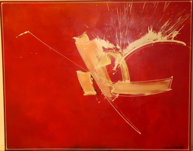
Her pictorial language, however, cannot stop at the simple use of acrylic, but also needs to introduce experimentation with matter, that interweaving of collage with the introduction of cardboard, strings, fabric, stone, sand, gold leaf, paint, textiles; everything contributes to emphasising Isolde Mischkot‘s emotional message, that invitation to the observer to get in touch with her own sensations through which she allows herself to be guided in the instinctive understanding of her striking works. The red and yellow, predominantly present in her canvases, emanate a strong and decisive energy, the same energy that is needed to face with courage and determination the circumstances that follow one another and that, even when sudden and overwhelming, are necessary for the evolution of the individual, to measure oneself against one’s own ability to get up and find meaning in everything; the artworks in softer tones, sometimes enriched with gold leaf, seem to be the expression of a balance, of a stability from which emerges all the serenity, all the contentment that after a path full of trials and obstacles one manages to conquer. Perhaps the same path that led Isolde Mischkot to give up and then again to decide to pursue her artistic dream. In the canvas Power, in fact, emerges all the will and resilience necessary to overcome difficulties, to surpass apparent blockages, represented by a thick black line that seems like an insurmountable opposition in reaching the next level; and yet, in spite of everything, the human being, the soul, somehow manages to get around the impediments, to proceed even at the cost of causing itself wounds, told by the horizontal lines that look like cuts on the sides of the central part of the composition marked by the colour beige, and then emerge upwards almost forgetting the difficulties because fulfilled by the goal achieved.
Isolde Mischkot‘s outlook on life is always positive, her strong energy and resoluteness propagate from her canvases and intensely reach the observer, leading him into her world of awareness and also of courage in facing the ups and downs of existence. In the painting Moment, the different chromatic spots seem to be the contrasting emotions that follow one another at certain junctures, those confused circumstances that happen suddenly, generating a range of reactions, at times even divergent but then all converging in the whole of the experience, of what each individual, at certain moments in life, has to deal with. The next moment everything takes on a different, more comprehensive meaning and it is therefore up to the person involved in the event to be able to move away from contingency to observe the broader design that the energies are pointing to. But one’s path, if one has the ability to draw lessons and experience from all that happens, sometimes even too quickly, then evolves towards a wisdom capable of instilling harmony, calm and serenity, which are in fact the sensations towards which any human being tends and which Isolde Mischkot interprets by choosing light tones, often enriched with gold leaf, as in the work Golden inspiration, or realised on media other than canvas, such as wood, precisely to emphasise how concrete and stable the individual’s evolution can be if he maintains an indispensable openness towards listening to himself and the energies that surround him. Harmony is therefore the utmost expression of this concept, it tells of that enveloping calm that emerges when one is able to achieve full awareness of oneself, of past battles, of the strength that had to be employed to re-emerge and to find that functional balance to smile more at circumstances without the fear of being destabilised by them. Isolde Mischkot exhibits regularly in Vienna and all over Austria, receiving acclaim from the public and the professionals.


