
Il distacco dalla realtà osservata, e la scelta di un approccio pittorico che tenda verso l’astrazione più totale, non impedisce ad alcuni artisti di rivelare proprio dietro la schematicità narrativa, considerazioni e riflessioni sulla società attuale, sulla capacità di interazione degli individui ma anche sul caos che si respira nelle città, affascinante quanto soffocante dal punto di vista della socializzazione. Eppure è proprio grazie a quelle possibilità di entrare in contatto gli uni con gli altri che l’umanità è sempre evoluta, si è costruita, adattandosi a nuove regole, a inedite forme di convivenza inizialmente osteggiate ma poi acquisite come parte della normalità; è esattamente su questo tipo di riflessione che si sviluppa la produzione artistica di Ronald Hunter che riscopre un gusto estetico razionalista per poi avvolgerlo con l’emozione dei colori.
Il periodo che precedette la prima guerra mondiale vide il sorgere di numerose avanguardie artistiche il cui scopo era quello di distaccarsi dalle regole accademiche tradizionali non più al passo con i tempi e con il rapido progresso dell’epoca, ma in fondo anche quello di scoprire nuovi modi di manifestare una creatività che non doveva più essere legata alla realtà. Le esplorazioni più estreme furono compiute dagli esponenti dell’Arte Astratta che ripudiarono ogni tipo di riferimento contingente per spingersi verso la purezza plastica rappresentata attraverso forme fluttuanti su sfondi neutri e monocromi, come nel caso dell’Astrattismo Lirico di Vassily Kandinsky e del Suprematismo di Kazimir Malevič, oppure verso il rigore assoluto della geometricità e dei colori primari del De Stijl di Piet Mondrian e Theo van Doesburg.
Il pragmatismo e l’approccio razionale-analitico alla pittura si associavano perfettamente alla corsa verso il progresso generatosi dopo la Rivoluzione Industriale, spingendo gli artisti ad adeguarsi a quel cambiamento nell’approccio alla vita che da essa si era generata; fu proprio sulla base di questo tipo di atteggiamento innovativo e sperimentale che nacque nella Repubblica di Weimar, in Germania, una scuola dove questi avanguardisti, insieme ad altri rappresentanti delle arti e dei mestieri che sposarono la loro idea, insegnarono e si unirono per dare vita a un’unione tra varie discipline che potevano tutte fondersi e rientrare insieme nel concetto di arte. La scuola prese il nome di Bauhaus e fu contraddistinta dalla cooperazione tra pittura, scultura, grafica, design, ceramica, decorazione del vetro, falegnameria, solo per citare alcune delle discipline insegnate, racchiuse sotto uno stile razionalista che mise la geometricità al centro della ricerca espressiva.
Il rigore cromatico e geometrico di Theo van Doesburg fu ammorbidito dall’interazione con altri autori generando manifesti e opere in cui subentravano anche forme rotonde e tubolari tassativamente escluse dal De Stijl, così come la gamma cromatica si aprì a tonalità più intermedie e optical, anticipando l’alternanza di vuoti e pieni che fu alla base della successiva Op Art. Furono in particolare Herbert Bayer e László Moholy-Nagy a utilizzare forme tondeggianti, trasparenze e sovrapposizioni che in qualche modo erano una delle basi espressive dei manifesti della Bauhaus, mentre Josef Albers sovvertì ogni rigore coloristico per entrare nel mondo della vivacità e delle sfumature in virtù delle quali i suoi quadrati sembravano diventare ipnotici. In questi autori era evidente l’esigenza di essere al passo con i tempi, di studiare spazi e soluzioni visive che si conformassero al vento innovativo della società dimenticando tuttavia di analizzare l’arte e l’individuo da un punto di vista più esistenzialista, meno logico e razionale perché al di là della sperimentazione il compito della rappresentazione visiva è quello di dare emozione, o quanto meno stimolare un desiderio di approfondimento e di comprensione dell’intenzione creativa dell’esecutore di un’opera, inducendo così l’osservatore a sentirsi coinvolto.
L’artista olandese Ronald Hunter sceglie una figurazione astrattista geometrica che tuttavia si allontana dalle ferree regole del De Stijl, che peraltro aveva visto la nascita proprio nella sua nazione di provenienza, per andare verso una morbidezza di forme più simile ai manifesti Bauhaus anche per quanto riguarda le possibilità cromatiche che tuttavia in lui assumono una vivacità più Pop Art; ma la modificazione più sostanziale consiste nell’introduzione del concetto, di quell’osservazione della realtà contemporanea e delle sue singolari abitudini mostrando la fascinazione che egli riceve dalla velocità della quotidianità e dalla consapevolezza dell’essere parte di una moltitudine che vive, si muove e respira giorno dopo giorno come un mosaico in costante movimento.
Osservando quelle interconnessioni, quelle ripetizioni di figure uguali a se stesse eppure diverse per tonalità e per dimensioni, la memoria non può non correre verso la singolare Pop Art di Keith Haring, dove la sua umanità stilizzata era unita indissolubilmente senza soluzione di continuità, sottolineando il forte legame che ciascuno ha con chiunque ruoti intorno alla sua esistenza; in Ronald Hunter questo stesso concetto è espresso attraverso la geometricità tondeggiante e ammorbidita da tonalità pastello, delicate e stratificate proprio per enfatizzare la molteplicità di vite che vanno a generare la società attuale. Non vi è contestazione né desiderio di fuga dalla realtà nelle sue tele bensì piuttosto consapevolezza e sguardo benevolo, suggerendo che è solo in virtù della consapevolezza dello stato dei tempi moderni che si può apprezzare il positivo in grado di emergere da essi.
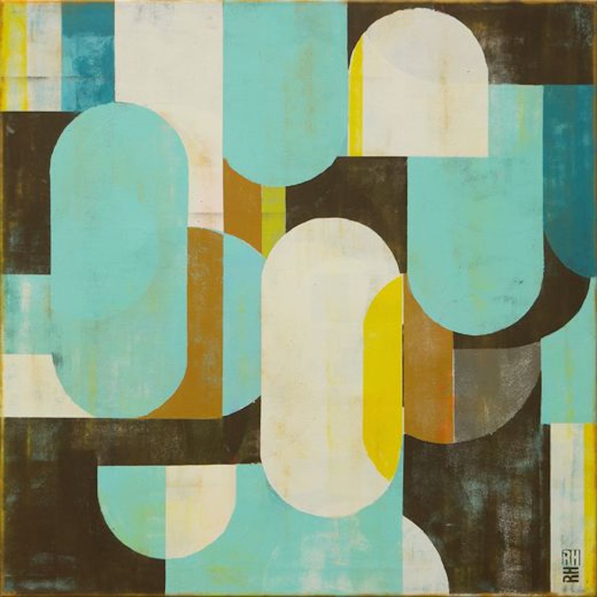
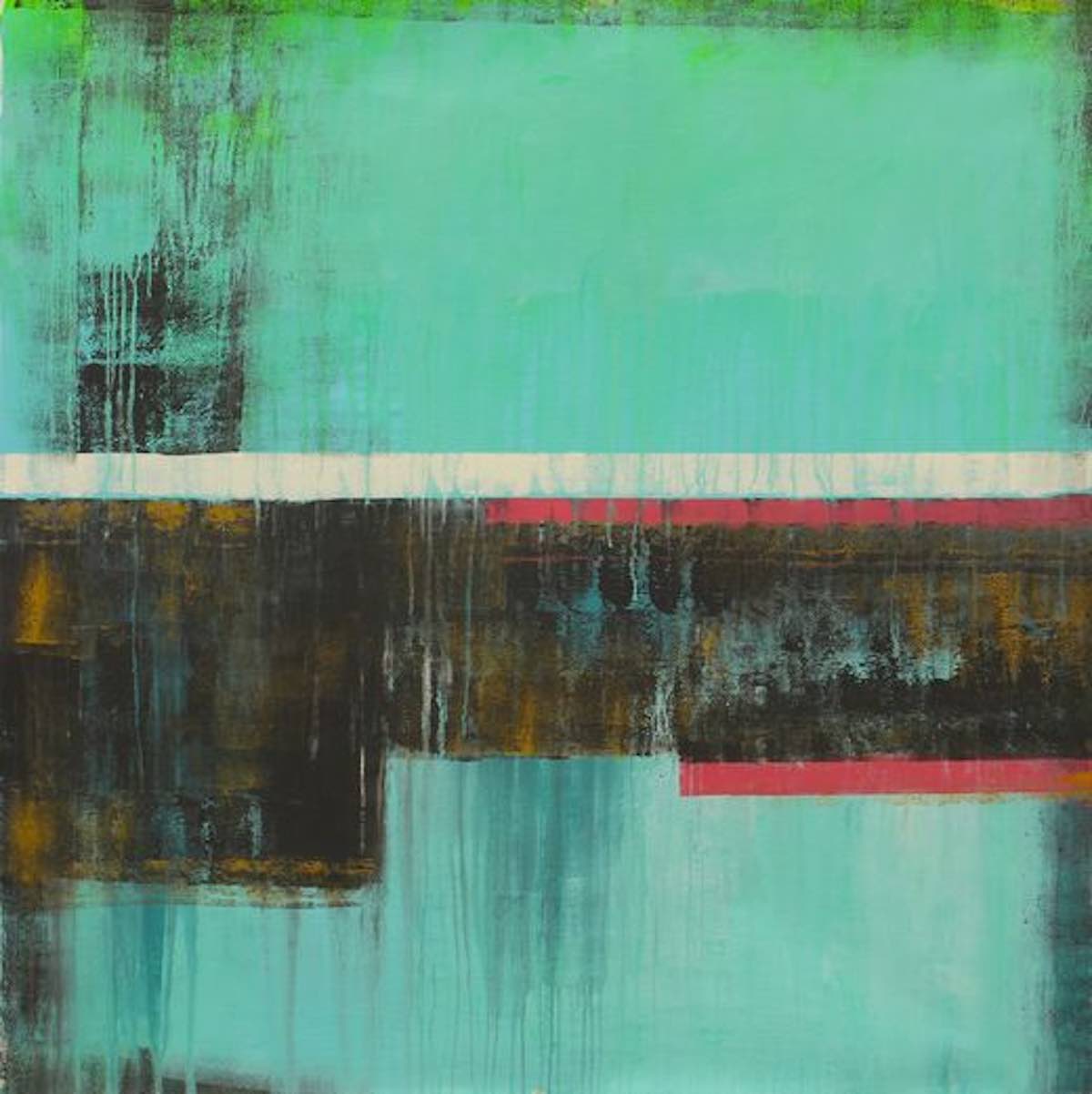
Questo messaggio è preponderante nella serie di opere denominate Traffic dove le forme tubolari sono legate e sovrapposte le une alle altre riproducendo il fascino delle metropoli attuali in cui la moltitudine di persone vive e affolla le strade per svolgere il proprio compito quotidiano, per muoversi, per realizzare i propri sogni o semplicemente per trovare quella socializzazione necessaria a ciascun essere umano, malgrado l’avvento dei social media voglia far credere il contrario. La gamma cromatica è sempre delicata, trasparente in alcuni casi, quasi Ronald Hunter volesse evidenziare il positivo del caos contemporaneo, quelle infinite possibilità e quell’innegabile progresso che in passato erano inafferrabili inducendo l’individuo ad adeguarsi ai percorsi tracciati e limitanti.
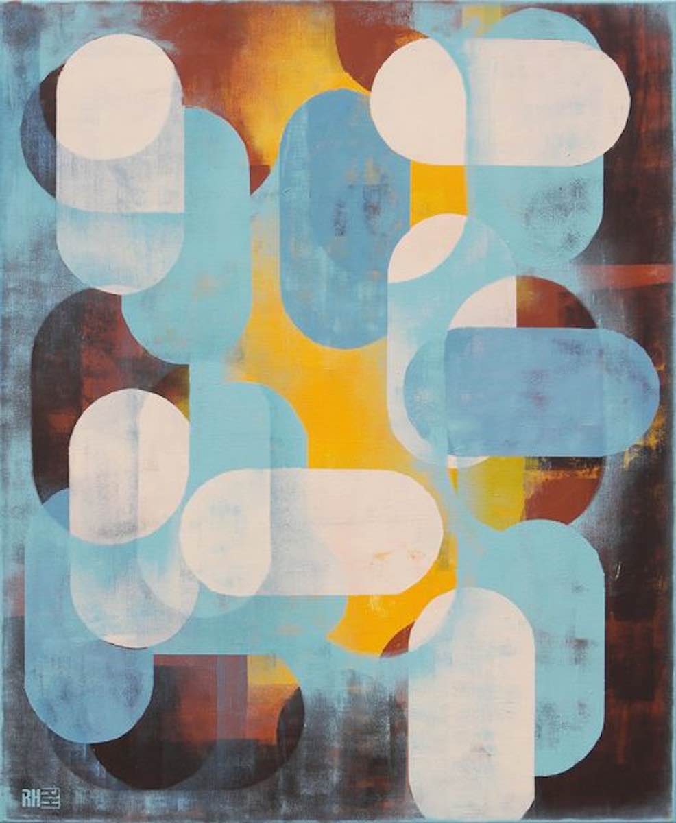
In altre tele invece fuoriesce un approccio pittorico più schematico che ricorda i segni grafici della fine dei programmi televisivi o della pausa di utilizzo dei primi personal computer, le stesse che avevano fatto parte della figurazione Bauhaus in cui veniva fortemente enfatizzata l’apertura verso la nuova tecnologia, l’analisi e la ricerca rigorosa secondo la quale l’arte doveva essere espressione dei tempi adeguandosi sotto ogni punto di vista a un nuovo gusto estetico più razionale. Ronald Hunter, pur ripercorrendo quel tipo di figurazione, ne dà una nuova interpretazione, la sfuma, la investe di colori pastello, la ammorbidisce suggerendo quanto anche dentro la logica più ferrea possano nascondersi emozioni, sensazioni in grado di dare una versione differente della realtà permettendo all’essere umano di interagire in maniera più empatica con l’altro.
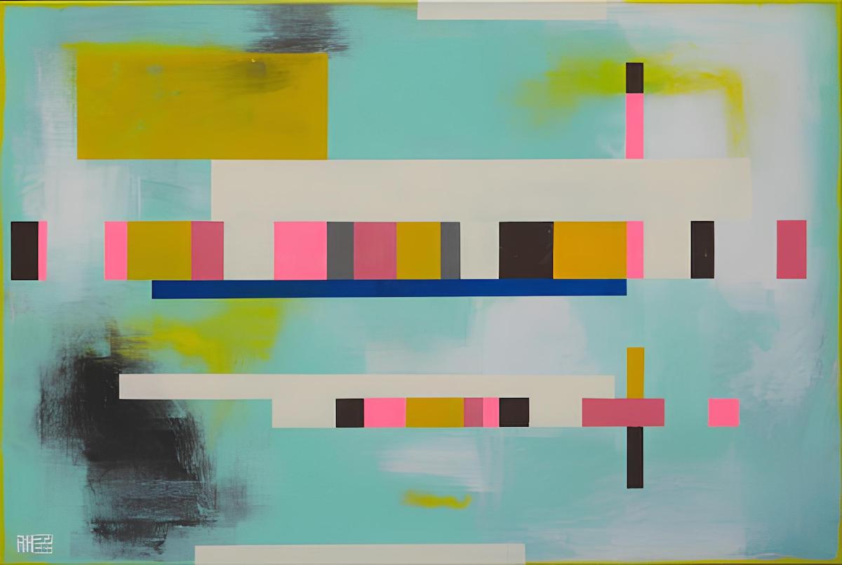
Master plan blue appartiene a questa serie di opere in cui i pixel del televisore che sta per spegnersi vengono mostrati secondo una scala di colori insolita, non più costituita da colori primari bensì da quei sottotoni con cui tutto assume un aspetto più poetico, delicato, soprattutto nel momento in cui lo sguardo si sposta verso lo sfondo, sfumato e impalpabile, quasi a voler evocare un’atmosfera sognante. Il messaggio dell’autore è dunque quello di lasciar emergere la morbidezza dalla rigidità, di accogliere la logica e qualsiasi supporto tecnologico senza perdere mai il lato emozionale di un sé che necessita di bilanciarsi lasciando convivere entrambe le sue nature.
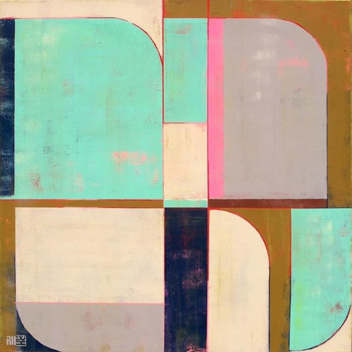
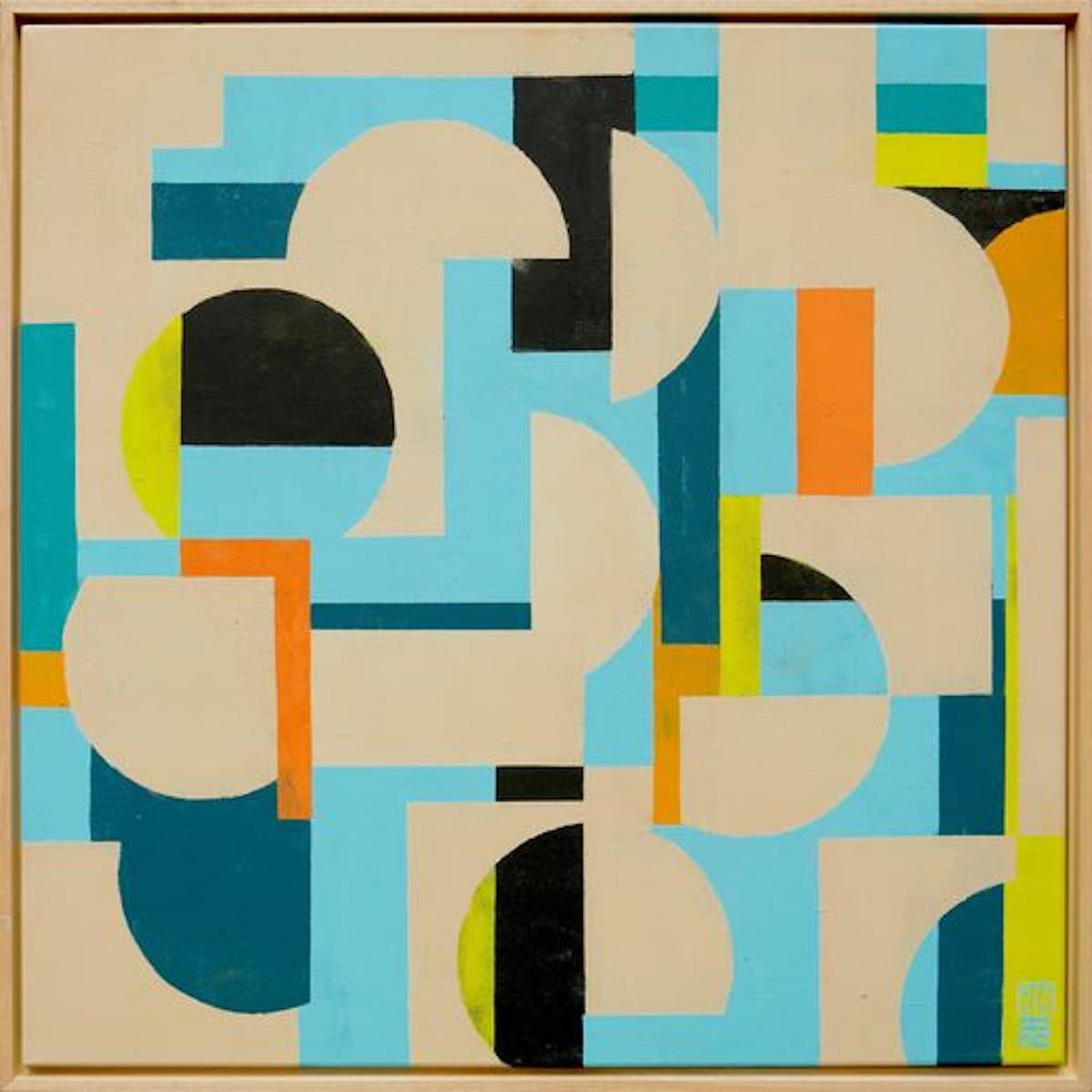
Nella serie Circle in circle emerge pienamente l’ispirazione Bauhaus a cui Ronald Hunter si lega, ma anche in questo caso a sorprendere lo sguardo è la cromaticità dell’autore, quella scelta di non porsi mai in maniera netta e decisa piuttosto di orientarsi verso un compromesso esistenziale dove tutto può essere determinato ma al contempo possibile, come se non potesse esistere nulla di assolutamente vero e assolutamente falso perché molto spesso la verità viene trovata attraverso il dubbio, il mettere in discussione ogni cosa e, dopo averla raggiunta, mantenere l’apertura a un ulteriore cambiamento se le circostanze lo richiedono. Le sfumature dell’acrilico sembrano dissolvere i confini tracciati dalle linee così come sembrano voler rompere gli argini delle figure geometriche dentro cui sono posti perché tutto ciò che appartiene all’interiorità e all’emozione non può restare a lungo all’interno della rigorosità delle regole.
Ronald Hunter ha avuto una formazione come grafico pubblicitario, grazie alla quale ha avuto una carriera di successo, ma poi ha avvertito la necessità di dare sfogo al suo lato più creativo avvicinandosi alla pittura senza più lasciarla; le sue opere fanno parte di collezioni private, locali commerciali, ospedali ed edifici pubblici in tutto il mondo.
RONALD HUNTER-CONTATTI
Sito web: www.ronaldhunter.com/
Facebook: www.facebook.com/ronaldhunterpainter
Instagram: www.instagram.com/ronaldhunterpaintings/
Ronald Hunter’s Bauhaus style, when form meets concept
The detachment from observed reality and the choice of a pictorial approach that tends towards total abstraction does not prevent some artists from revealing, behind the narrative schematics, considerations and reflections on today’s society, on the ability of individuals to interact, but also on the chaos that reigns in cities, which is as fascinating as it is suffocating from the point of view of socialization. Yet it is thanks to these opportunities to connect with one another that humanity has always evolved and built itself, adapting to new rules and unprecedented forms of coexistence that were initially opposed but then accepted as part of normality. It is precisely on this type of reflection that develops Ronald Hunter’s artistic production, rediscovering a rationalist aesthetic taste and then enveloping it with the emotion of colors.
The period leading up to the First World War saw the emergence of numerous artistic avant-gardes whose aim was to break away from traditional academic rules that were no longer in step with the times and the rapid progress of the era, but also to discover new ways of expressing creativity that was no longer tied to reality. The most extreme explorations were carried out by exponents of Abstract Art, who rejected any kind of contingent reference in order to push towards plastic purity represented through floating forms on neutral, monochrome backgrounds, as in the case of Vassily Kandinsky‘s Lyric Abstractionism and Kazimir Malevich‘s Suprematism, or towards the absolute rigor of geometry and primary colors of Piet Mondrian and Theo van Doesburg‘s De Stijl. Pragmatism and a rational-analytical approach to painting were perfectly suited to the race towards progress that emerged after the Industrial Revolution, pushing artists to adapt to the change in approach to life that it had generated.
It was precisely on the basis of this innovative and experimental attitude that was founded a school in the Weimar Republic in Germany, where these avant-garde artists, together with other representatives of the arts and crafts who embraced their idea, taught and joined forces to create a union between various disciplines that could all merge and come together under the concept of art. The school took the name Bauhaus and was characterized by cooperation between painting, sculpture, graphic design, design, ceramics, glass decoration, and carpentry, to name just a few of the disciplines taught, all encompassed within a rationalist style that placed geometry at the center of expressive research. Theo van Doesburg‘s chromatic and geometric rigor was softened by interaction with other artists, generating posters and artworks that also featured round and tubular shapes strictly excluded from De Stijl, just as the color range opened up to more intermediate and optical shades, anticipating the alternation of empty and full spaces that was the basis of the subsequent Op Art. Herbert Bayer and László Moholy-Nagy, in particular, used rounded shapes, transparencies, and overlaps that were, in some ways, one of the expressive bases of Bauhaus posters, while Josef Albers subverted all coloristic rigor to enter the world of liveliness and nuances, thanks to which his squares seemed to become hypnotic. These artists clearly felt the need to keep up with the times, to study spaces and visual solutions that conformed to the innovative spirit of society, forgetting, however, to analyze art and the individual from a more existentialist, less logical and rational point of view because, beyond experimentation, the task of visual representation is to evoke emotion, or at least stimulate a desire to explore and understand the creative intention of the artist, thus encouraging the observer to feel involved. Dutch artist Ronald Hunter chooses a geometric abstract figuration that nevertheless departs from the strict rules of De Stijl, which originated in his country of origin, moving towards a softness of form more similar to Bauhaus posters, also in terms of color possibilities, which nevertheless take on a more Pop Art liveliness in his work; but the most substantial change consists in the introduction of the concept, of that observation of contemporary reality and its singular habits, showing the fascination he receives from the speed of everyday life and the awareness of being part of a multitude that lives, moves, and breathes day after day like a mosaic in constant motion.
Observing these interconnections, these repetitions of figures that are identical yet different in tone and size, one cannot help but be reminded of Keith Haring‘s unique Pop Art, where his stylized humanity was inextricably linked without interruption, emphasizing the strong bond that each person has with everyone else in their life; in Ronald Hunter, this same concept is expressed through rounded geometric shapes softened by delicate, layered pastel shades, precisely to underline the multiplicity of lives that make up today’s society. There is no protest or desire to escape reality in his canvases, but rather awareness and a benevolent gaze, suggesting that it is only through consciousness of the state of modern times that one can appreciate the positive that can emerge from them. This message is predominant in the series of artworks called Traffic, where tubular shapes are linked and superimposed on each other, reproducing the charm of today’s metropolises, where crowds of people live and fill the streets to carry out their daily tasks, to move around, to realize their dreams, or simply to find the socialization necessary for every human being, despite the advent of social media wanting us to believe the opposite.
The color palette is always delicate, transparent in some cases, as if Ronald Hunter wanted to highlight the positive aspects of contemporary chaos, those infinite possibilities and undeniable progress that were previously elusive, forcing individuals to conform to predetermined and limiting paths. In other canvases, however, emerges a more schematic pictorial approach, reminiscent of the graphic signs at the end of television programs or when the first personal computers were paused, the same ones that were part of the Bauhaus figuration which strongly emphasized openness to new technology, analysis, and rigorous research according to which art had to be an expression of the times, adapting in every respect to a new, more rational aesthetic taste. Ronald Hunter, while retracing that type of figuration, gives it a new interpretation, blurring it, investing it with pastel colors, softening it, suggesting that even within the most rigid logic, emotions and sensations can be hidden, capable of giving a different version of reality, allowing human beings to interact more empathetically with each other. Master plan blue belongs to this series of works in which the pixels of a television that is about to switch off are shown in an unusual color scale, no longer consisting of primary tones but rather of those undertones that give everything a more poetic, delicate appearance, especially when the gaze shifts to the background which is blurred and intangible, as if to evoke a dreamlike atmosphere. The author’s message is therefore to let softness emerge from rigidity, to embrace logic and any technological support without ever losing the emotional side of a self that needs to balance by allowing both its natures to coexist.
The Circle in Circle series fully reveals the Bauhaus inspiration to which Ronald Hunter is linked, but here too, what surprises the eye is the artist’s chromaticity, his choice never to take a clear and decisive stance, but rather to move towards an existential compromise where everything can be determined but at the same time possible, as if nothing could exist that is absolutely true or absolutely false, because very often truth is found through doubt, questioning everything and, once it has been reached, remaining open to further change if circumstances require it. The nuances of acrylic seem to dissolve the boundaries traced by lines, just as they seem to want to break the banks of the geometric figures within which they are placed, because everything that belongs to interiority and emotion cannot remain for long within the rigidity of rules. Ronald Hunter trained as a graphic designer, thanks to which he had a successful career, but then felt the need to give vent to his more creative side by turning to painting and never leaving it; his artworks are part of private collections, commercial premises, hospitals, and public buildings around the world.


