Non sempre la realtà, in particolar modo quella artistica, riesce a rimanere all’interno di schemi ben definiti anzi, nel periodo contemporaneo gli autori tendono a mescolare, a fondere insieme diverse sfaccettature stilistiche che si concretizzano in un’apparenza insolita, al di fuori dagli schemi ma grazie alla quale le correnti del passato trovano nuova linfa e si rigenerano in versioni innovative e più al passo con i tempi attuali. L’artista di cui vi racconterò oggi ottiene, dopo un periodo precedente più definito, uno stile personale in cui sovrappone due linguaggi pittorici originariamente ben distinti e lontani l’uno dall’altro, per dare vita a una cifra stilistica rafforzata dagli estremi abilmente mescolati e resi armonici grazie all’eleganza del suo tratto.
Agli inizi del Novecento si generò una frattura netta tra l’espressione artistica dei secoli precedenti, quando la riproduzione della realtà osservata doveva tendere verso la perfezione estetica e descrittiva, e le innovazioni avanguardiste di un’epoca in rapido cambiamento in cui emersero due tendenze diverse e persino opposte: quella che andava verso un rifiuto totale di ogni narrazione dell’oggettività, scegliendo un’autonomia del gesto plastico che doveva bastare a se stesso, e quella in cui a predominare su ogni equilibrio estetico doveva essere l’individualità, il sentire dell’autore di un’opera in funzione delle sensazioni ricevute dall’ambiente descritto.
L’Astrattismo, il primo tra i due approcci menzionati, andò verso un distacco totale da tutto ciò che privasse l’arte di quella supremazia espressiva secondo la quale non doveva avere bisogno di ricondurre lo sguardo a immagini concrete e conosciute; all’interno di questo contesto le sfaccettature interpretative andarono dalla geometricizzazione assoluta del Suprematismo, del Costruttivismo e del De Stijl, alla totale mancanza di forma dove il colore era assoluto dominatore delle tele che mostravano dunque un’attitudine istintiva e impulsiva, come per l’Informale. L’Espressionismo invece, il secondo approccio, mantenne il legame con una figurazione che però divenne deformata, completamente assoggettata al vortice di emozioni e sensazioni impossibili da trattenere da parte dell’esecutore di un’opera e che proprio in virtù di quella rinuncia all’equilibrio estetico, ai formalismi accademici, alla prospettiva e alla stesura tradizionale del colore, riusciva a coinvolgere e a far vibrare le corde interiori del fruitore.
La rigorosità compositiva del De Stijl olandese di Piet Mondrian trovò un ammorbidimento nell’evoluzione compiuta dall’Astrattismo Geometrico, tanto quanto gli eccessi aggressivi dei Fauves francesi evolsero in un’attenuazione cromatica più in linea con la svolta esistenzialista di molti interpreti, tra cui Egon Schiele e, qualche decennio dopo Lucian Freud. Eppure anche in quel periodo tanto rigido sulle linee guida delle avanguardie artistiche, vi furono alcuni autori che provarono a sovvertire le regole cercando di unire stili diversi per adattarli alla propria poetica espressiva, come nel caso di Paul Klee che pur essendo un elemento importante del gruppo espressionista tedesco Der Blaue Reiter, mostrò una spiccata autonomia creativa e distintiva inserendo elementi fortemente astratti geometrici all’interno delle sue atmosfere espressioniste. E in fondo anche il grande interprete del Secessionismo Viennese, Gustav Klimt, ha mescolato nel suo delicato Espressionismo elementi che presentavano la stilizzazione e la frammentazione dell’Astrattismo mettendo dunque in evidenza quanto la sintesi a volte sia più affascinante del rimanere ostinatamente chiusi all’interno di gabbie espressive che impediscono la personalizzazione più autentica di ciascun autore.
L’artista triestina Patrizia Grubissa, dopo aver scoperto in giovanissima età la sua forte inclinazione verso l’arte visiva, e dopo essere stata costretta dalle scelte e dall’imprinting familiare a intraprendere studi che le avrebbero garantito una carriera sicura, decide di affiancare l’attività creativa a quella di imprenditrice dando vita a mobili disegnati da lei e commercializzati sul mercato del Medio Oriente. Malgrado in qualche modo il suo lato artistico si sentisse appagato, ha successivamente avvertito l’impulso di riprendere in mano i colori e le tele, frequentando corsi di pittura, per tornare alle origini del suo percorso nel mondo della creatività.
Il suo stile si è perfezionato, inizialmente rimanendo nell’ambito espressionista perché più affine alla sua natura e alla sua esigenza di rimanere legata a una figurazione tradizionale sebbene sempre arricchita da un tocco personale, poi si è evoluto fino allo stile attuale che è appunto una fusione tra il suo lato più osservativo, che pertanto ha bisogno di restare all’interno di una rappresentazione vicina alla realtà che la circonda, e quello più percettivo e istintivo in virtù del quale gli sfondi, o alcuni dettagli dei suoi personaggi, sono contraddistinti dall’indefinitezza dell’Espressionismo Astratto, oppure da una geometricità sfumata che richiama il De Stijl e l’Astrattismo Geometrico superati dalla caratteristica di Patrizia Grubissa di sfumare e smussare ciò che nei due movimenti appena citati era più rigorosamente definito.
Il risultato è una mescolanza intensa dove a volte prevale una spiccata stilizzazione delle figure che quasi si perdono nella cromaticità astrattista, in altri casi invece prevale la narrazione espressionista che spicca su sfondi completamente decontestualizzati ma soprattutto indefiniti e ancora in altre ciò che fuoriesce è la pura emozione quasi graffiata sulla superficie della tela e in cui l’Espressionismo coesiste in perfetto accordo con l’Informale. Tutto è dunque funzionale a raccontare le sensazioni riconducibili ai soggetti o a ciò che rappresentano nel contesto interpretativo della tela, affidando alle variazioni cromatiche la narrazione dell’emotività, o dell’istante immortalato.
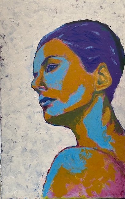
L’opera Anita va a scolpire quasi, la personalità della donna che appare pertanto serena quanto determinata, dolce nello sguardo ma spigolosa nell’atteggiamento e nella fisicità, quasi Patrizia Grubissa volesse sottolineare gli opposti di un carattere in bilico tra il lasciarsi dominare dal lato più morbido e il non dimenticare la forza necessaria a perseguire i propri obiettivi. Il frangente immortalato dall’autrice è forse un momento di riflessione, un bisogno di aprirsi allo sguardo dell’osservatore mostrando i propri veri colori che non possono fare a meno di essere colti e inseriti nella tela come parte imprescindibile del sé.
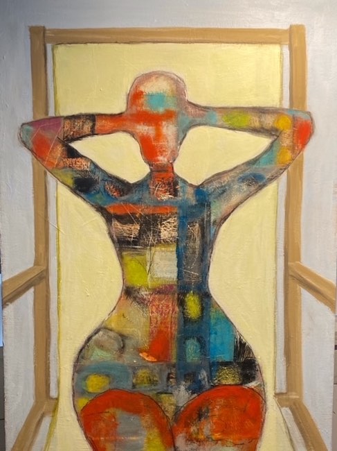
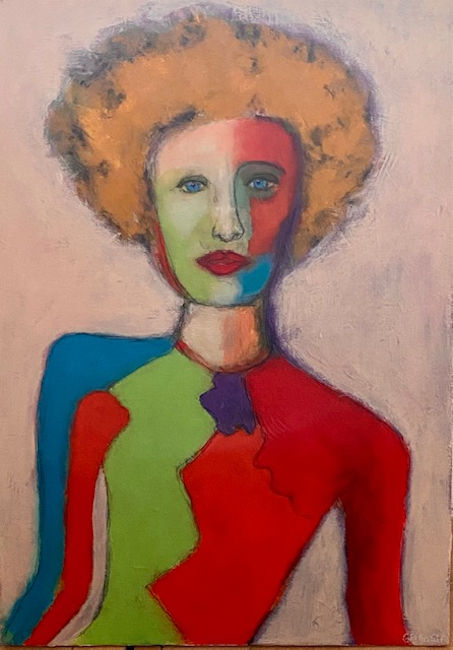
In Sapore di mare la sagoma femminile mostra una sinuosità curvilinea, enfatizzando la piacevolezza della sensazione provata durante le giornate di vacanza estiva, quando l’unica preoccupazione è quella di uscire per andare in spiaggia, dove il tempo trascorre lento e rarefatto e la libertà è il solo imperativo a cui sottostare; qui Patrizia Grubissa cita e in qualche modo unisce la geometricità e rigorosità del De Stijl di Mondrian alle colorate tessere a mosaico utilizzate da Gustav Klimt, sfumando e graffiando il risultato finale, per raccontare tutto il caleidoscopio di emozioni che appartengono alla donna e che fuoriescono in maniera inconsapevole dalla posa assunta e da quel suo aprirsi verso l’osservatore, quasi volesse suggerirgli di permettere a quella positività di avvolgerlo.
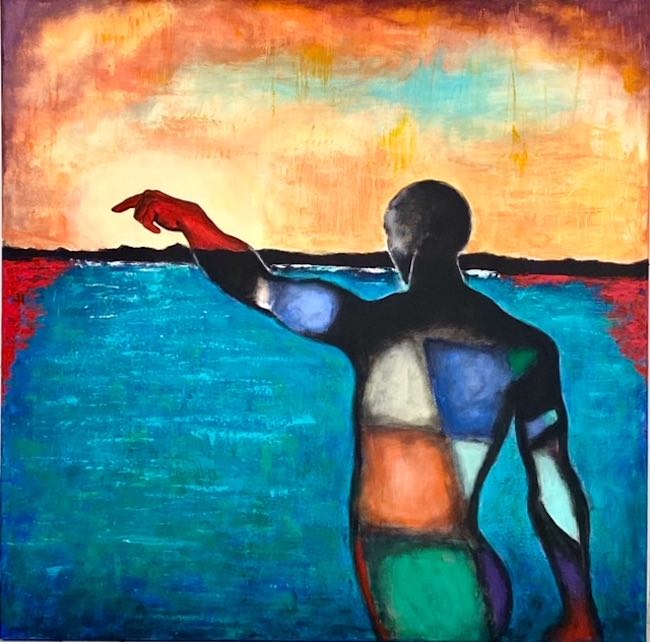
Nel dipinto Verso la luce l’utilizzo dei riferimenti al Neoplasticismo è persino più evidente arrivando a predominare il protagonista dell’opera perché il senso metaforico deve emergere in maniera chiara e inequivocabile; dunque le tonalità primarie, che qui si alternano ad altre come il verde e l’arancione, contornate dal nero simboleggiano l’esigenza dell’uomo di tendere verso la luminosità all’orizzonte. La tela rappresenta dunque un’esortazione da parte di Patrizia Grubissa a non permettere all’ombra, intesa come visione negativa o semplice difficoltà temporanea, di predominare perché ciò che è fondamentale è di cercare sempre la via d’uscita, di conquistare la capacità di guardare avanti nella convinzione che solo scegliendo una strada nuova, e compiendo nuove azioni, sarà possibile avere risultati diversi. La parte nera dell’uomo è limitata alla testa, intesa come spazio razionale in cui la logica spesso confonde e allontana dalla vera essenza, che è quella che al contrario costituisce il corpo, quella che induce l’uomo a sollevare il capo e a guardare davanti a sé inseguendo la speranza di un futuro migliore.
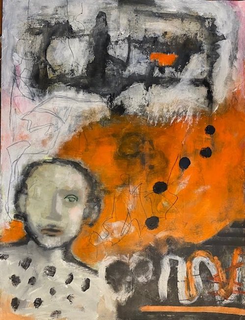
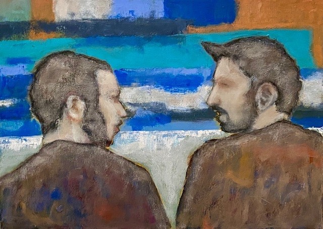
Ricordi appartiene invece al lato più espressionista di Patrizia Grubissa, che tuttavia non riesce mai a nascondere quella naturale inclinazione verso l’indefinitezza in questo caso lasciata come possibilità immaginativa, come equilibrio tra la realtà del soggetto in basso a sinistra che si lascia andare alla memoria di una circostanza vissuta, e l’evocazione di ciò che la sua mente non riesce a mettere a fuoco perché la mediazione dell’emozione sfuma tutti i contorni, soggettivizza ciò che quando vissuto è innegabilmente più oggettivo. Il colore predominante, l’arancione, suggerisce energia positiva, divertimento, solarità, sottolineando così l’approccio sorridente del ragazzo nei confronti di quell’istante in cui il ricordo ha preso il sopravvento; le sottili linee grafiche enfatizzano l’impossibilità di far correre la memoria verso i dettagli di quel momento magico, quasi come se tutto sfuggisse a parte la sensazione di piacevolezza.
Patrizia Grubissa ha cominciato solo cinque anni fa il suo percorso espositivo ma da quel momento ha partecipato a mostre personali e collettive a Trieste, dove ha ricevuto molti apprezzamenti per l’originalità della sua cifra stilistica.
PATRIZIA GRUBISSA-CONTATTI
Email: patrizia.grubissa@icloud.com
Facebook: www.facebook.com/patrizia.grubissa
Instagram: www.instagram.com/grubissa_art/
When Abstractionism enhances Expressionism in the artworks by Patrizia Grubissa
Reality, especially artistic one, does not always manage to remain within well-defined boundaries, indeed, in the contemporary period, authors tend to mix and blend different stylistic facets, resulting in an unusual appearance, outside the box, but thanks to which past trends find new life and are regenerated in innovative versions that are more in step with current times. The artist I am going to tell you about today, after a more defined previous period, has achieved a personal style in which she superimposes two originally distinct and distant pictorial languages to create a stylistic signature reinforced by extremes that are skillfully blended and harmonized thanks to the elegance of her brushstrokes.
At the beginning of the 20th century, there was a clear break between the artistic expression of previous centuries, when the reproduction of observed reality had to strive for aesthetic and descriptive perfection, and the avant-garde innovations of a rapidly changing era in which emerged two different and even opposing trends: one that moved towards a total rejection of any narrative of objectivity, choosing an autonomy of plastic gesture that had to be sufficient in itself, and one in which individuality had to predominate over any aesthetic balance, the feelings of the author of a work based on the sensations received from the environment described. Abstract art, the first of the two approaches mentioned, moved towards a total detachment from anything that deprived art of that expressive supremacy according to which it did not need to refer the gaze back to concrete and familiar images. within this context, the interpretative facets ranged from the absolute geometrization of Suprematism, Constructivism, and De Stijl, to the total lack of form where color was the absolute dominator of the canvases, which thus showed an instinctive and impulsive attitude, as in Informal Art. Expressionism, on the other hand, the second approach, maintained its link with figuration, which, however, became distorted, completely subject to the vortex of emotions and sensations that were impossible for the artist to contain and which, precisely because of this renunciation of aesthetic balance, academic formalism, perspective, and traditional color application, managed to engage and stir the innermost feelings of the viewer.
The compositional rigor of Piet Mondrian‘s Dutch De Stijl movement softened with the evolution of Geometric Abstractionism, just as the aggressive excesses of the French Fauves evolved into a more subdued use of color, more in line with the existentialist shift of many artists, including Egon Schiele and, a few decades later, Lucian Freud. Yet even in that period, which was so rigid in its artistic avant-garde guidelines, there were some artists who tried to subvert the rules by combining different styles to adapt them to their own expressive poetics, as in the case of Paul Klee who, despite being an important member of the German expressionist group Der Blaue Reiter, showed a marked creative and distinctive autonomy by inserting strongly abstract geometric elements into his expressionist atmospheres.
And ultimately, even the great interpreter of Viennese Secession, Gustav Klimt, mixed elements of stylization and fragmentation from Abstract Art into his delicate Expressionism, thus highlighting how synthesis is sometimes more fascinating than remaining stubbornly closed within expressive cages that prevent the most authentic personalization of each artist. Trieste-based artist Patrizia Grubissa , after discovering her strong inclination towards visual art at a very young age and after being forced by family choices and influences to pursue studies that would guarantee her a secure career, decided to combine her creative activity with that of an entrepreneur, designing furniture that she then marketed in the Middle East. Although her artistic side felt somewhat fulfilled, she subsequently felt the urge to pick up her paints and canvases again, attending painting courses to return to the origins of her journey in the world of creativity.
Her style was perfected, initially remaining within the expressionist realm because it was more in tune with her nature and her need to remain tied to traditional figuration, albeit always enriched with a personal touch, it then evolved into her current style, which is a fusion of her more observational side, which therefore needs to remain within a representation close to the reality that surrounds her, and her more perceptive and instinctive side, by virtue of which the backgrounds, or certain details of her characters, are marked by the indefiniteness of Abstract Expressionism, or by a nuanced geometricity that recalls De Stijl and Geometric Abstractionism, overcome by Patrizia Grubissa‘s characteristic of blurring and softening what was more rigorously defined in the two movements just mentioned. The result is an intense mixture where at times prevails a marked stylization of the figures, almost lost in the abstract chromaticity, in other cases, however, prevails the expressionist narrative standing out against backgrounds that are completely decontextualized but above all undefined, and in yet others, what emerges is pure emotion, almost scratched onto the surface of the canvas, in which Expressionism coexists in perfect harmony with Informalism.
Everything is therefore functional to recounting the sensations attributable to the subjects or what they represent in the interpretative context of the canvas, entrusting the narration of emotion, or of the immortalized moment, to chromatic variations. The artwork Anita almost sculpts the personality of the woman, who appears as serene as she is determined, sweet in her gaze but edgy in her attitude and physicality, as if Patrizia Grubissa wanted to emphasize the opposites of a character poised between letting herself be dominated by her softer side and not forgetting the strength necessary to pursue her goals. The awkward situation captured by the artist is perhaps a moment of reflection, a need to open up to the observer’s gaze, showing her true colors, which cannot help but be captured and incorporated into the canvas as an essential part of the self. In Sapore di mare (Taste of the Sea), the female silhouette shows a curvilinear sinuosity, emphasizing the pleasantness of the sensation experienced during summer vacation days, when the only concern is to go out to the beach, where time passes slowly and sparsely and freedom is the only imperative to which one must submit; here Patrizia Grubissa quotes and in some way combines the geometry and rigor of Mondrian‘s De Stijl with the colorful mosaic tiles used by Gustav Klimt, blurring and scratching the final result to convey the kaleidoscope of emotions that belong to the woman and that unconsciously emerge from her pose and her openness towards the observer, as if she wanted to suggest that they allow that positivity to envelop them. In the painting Verso la luce (Towards the Light), the use of references to Neoplasticism is even more evident, dominating the protagonist of the work because the metaphorical meaning must emerge clearly and unequivocally; therefore, the primary colors, which alternate here with others such as green and orange, surrounded by black, symbolize man’s need to strive toward the brightness on the horizon.
The canvas so represents an exhortation by Patrizia Grubissa not to allow shadows, understood as negative visions or simple temporary difficulties, to predominate, because what is fundamental is to always seek a way out, to acquire the ability to look ahead in the conviction that only by choosing a new path and taking new actions will it be possible to achieve different results. The black part of the man is limited to the head, understood as a rational space in which logic often confuses and distances from the true essence, which is what constitutes the body, what induces man to raise his head and look ahead, pursuing the hope of a better future. Ricordi (Memories), on the other hand, belongs to the more expressionist side of Patrizia Grubissa, who however never manages to hide that natural inclination towards indefiniteness, in this case left as an imaginative possibility, as a balance between the reality of the subject at the bottom left who lets himself go to the memory of a lived circumstance, and the evocation of what his mind cannot focus on because the mediation of emotion blurs all contours, it subjectivizes what, when experienced, is undeniably more objective. The predominant color, orange, suggests positive energy, fun, and cheerfulness, thus emphasizing the boy’s smiling approach to that moment when the memory took over; the subtle graphic lines underline the impossibility of running his memory through the details of that magical moment, almost as if everything escaped except the feeling of pleasure. Patrizia Grubissa began her exhibition path only five years ago, but since then she has participated in solo and group exhibitions in Trieste, where she has received much praise for the originality of her stylistic signature.


